
At FSO we build businesses from Scratch in 30 days – The Bizathon Challenge!
If you haven’t started with Shopify, you’ll want to by clicking here. This month we’re building a profitable Shopify store from the ground up.
Yesterday we revealed 2 Reasons Your Shopify Store Is Losing Money.
Today we cover crucial tips for “Mobile Optimization” of your Shopify Business.
Follow along as Rito shows you the importance of mobile optimization:
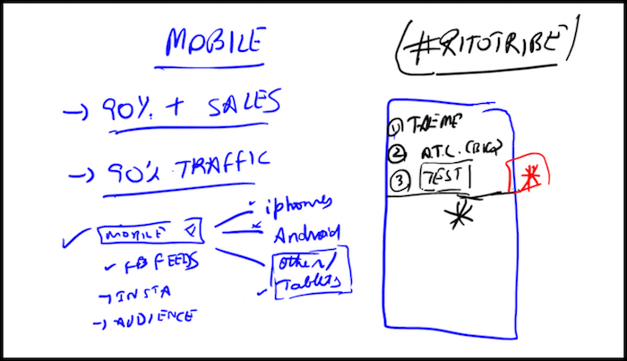
Today is all about mobile optimization for your Shopify store.
Mobile phones are the way of the future for the internet.
While you may be building or editing your Shopify store from your desktop or laptop, it’s not likely your customers are purchasing via the same mediums. They’re likely on their phones.
I wouldn’t be the least bit surprised to read a stat in a couple years that says something like, “99% of digital sales occurred on mobile devices last year…”
Long story short, if you’re online business, Shopify or otherwise, is not mobile optimized, you’re going to miss out on an exceptional amount of sales.
3 Shopify Store Mobile Optimization Tips
Each year since the capability became widely available, commerce occurring on mobile devices has dramatically increased.
In fact, with our Shopify store (Common Panda) we are already seeing more than 90% of our sales occurring on mobile devices.
Not only that, but more than 90% of our store traffic is occurring on mobile devices.
Here are 3 Shopify mobile optimization tips to implement…
Focus On Android and iPhones – Ignore Tablets
With well over $100,000 spent on ads over the past decade, we can tell your first hand, Tablet users do not convert well.
We want to maximize conversions while conserving as much of our ad spend as possible. In order to do this, we don’t target tablets at all anymore.
We invite you to consider the same, especially if you’re just starting out with digital commerce.
Use Mobile Ready Website Themes
The themes that are available these days are all mobile optimized,
We recommend that you utilize WordPress.org (not.com) for your online business needs. They are incredibly user friendly, trusted, and FREE to install on your own domain and hosting.
You can use any of the free themes which, while fairly basic, are all still visually pleasing and modern.
As you know, we use the Shopify Booster theme for our store.
But if you ever come across a website you like, and want to know which theme it’s using, assuming it’s WordPress (it probably is) just use WhatWordPressThemeIsThat to find out what they’re running.
Ensure Certain Features On Your Product Page
Aside from general mobile optimization, your Shopify store needs to have a couple other features.
Ensuring the following will make your product pages pop:
- Large Add To Cart Button
- Test Your Entire Checkout Process From Your Mobile Phone
- Test All Aspects Of Your Theme From Your Mobile
If your theme doesn’t come with a built in device preview feature, like the Shopify Booster theme, you can use a tool like ScreenFly to view your store from other devices.
That’s a wrap for Day 19 – Well done!
Questions, comments or just want to say hi? We love hearing from you below.
Success by choice, not by chance,
-David Aston
P.S.
If you’re not kept in the loop via our #Bizathon list be sure to sign up today.
P.P.S. Click here for Day 20!